RIVERISLAND
RIVERISLAND
RIVERISLAND
SS25 Digital Campaign System
SS25 Digital Campaign System
SS25 Digital Campaign System
Role — Self-Directed Brand & Campaign Designer
Imagery — Provided by River Island
Role — Self-Directed Brand & Campaign Designer
Imagery — Provided by River Island
Role — Self-Directed Brand & Campaign Designer
Imagery — Provided by River Island
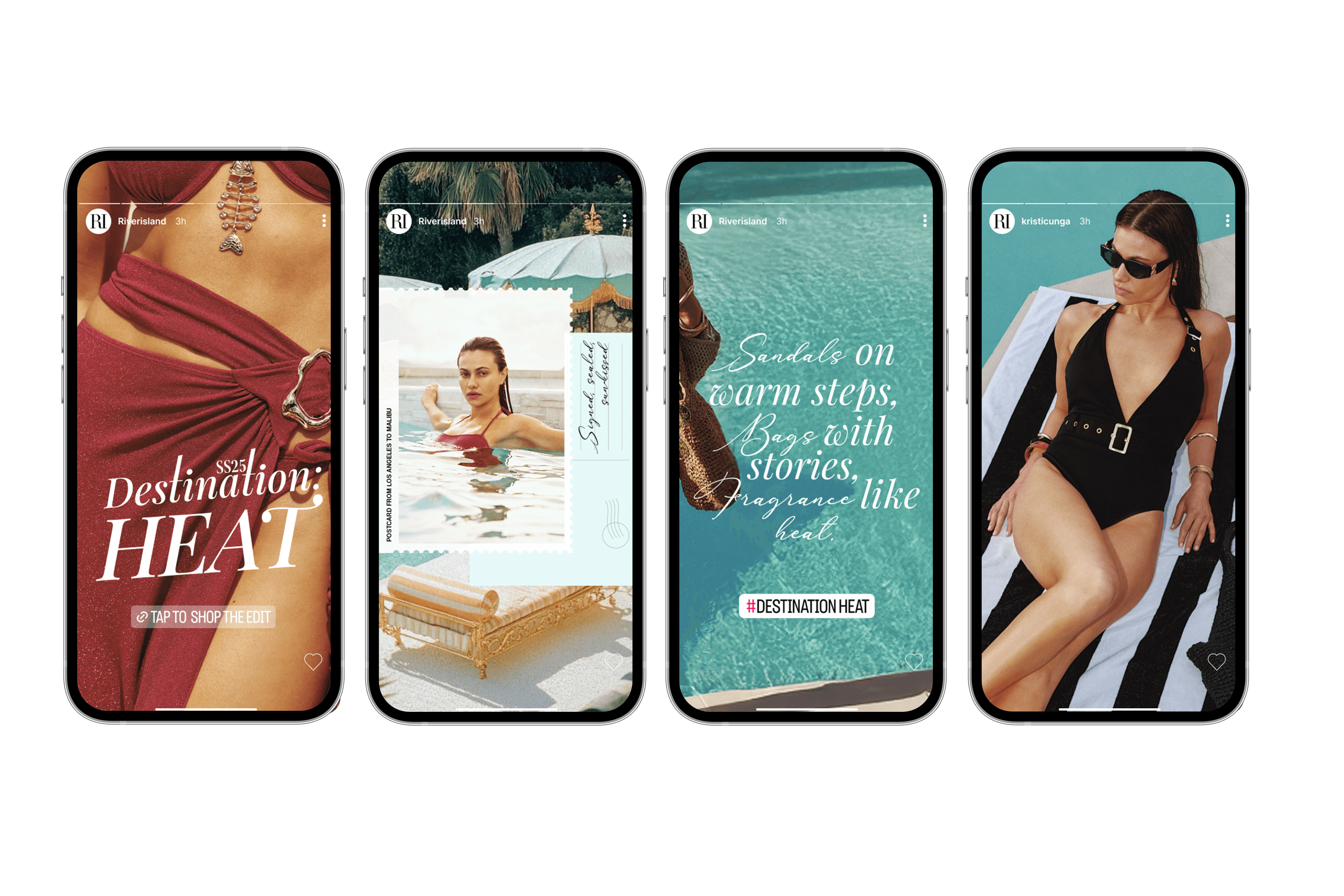
Developed a style-led SS25 campaign system translating River Island’s ‘Destination: Heat’ concept into a cohesive editorial rollout across digital touchpoints.
Developed a style-led SS25 campaign system translating River Island’s ‘Destination: Heat’ concept into a cohesive editorial rollout across digital touchpoints.
Developed a style-led SS25 campaign system translating River Island’s ‘Destination: Heat’ concept into a cohesive editorial rollout across digital touchpoints.
Visual Language
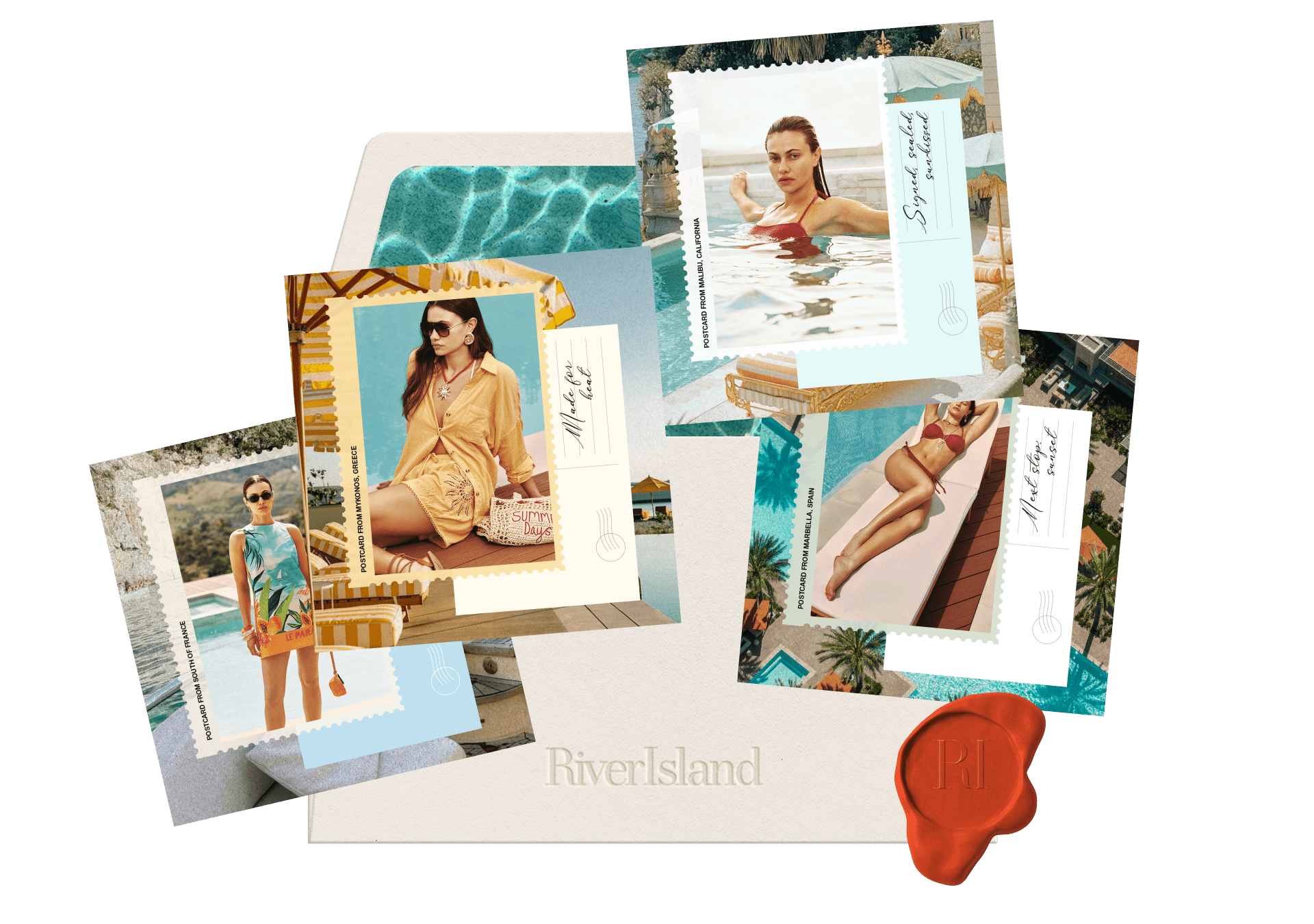
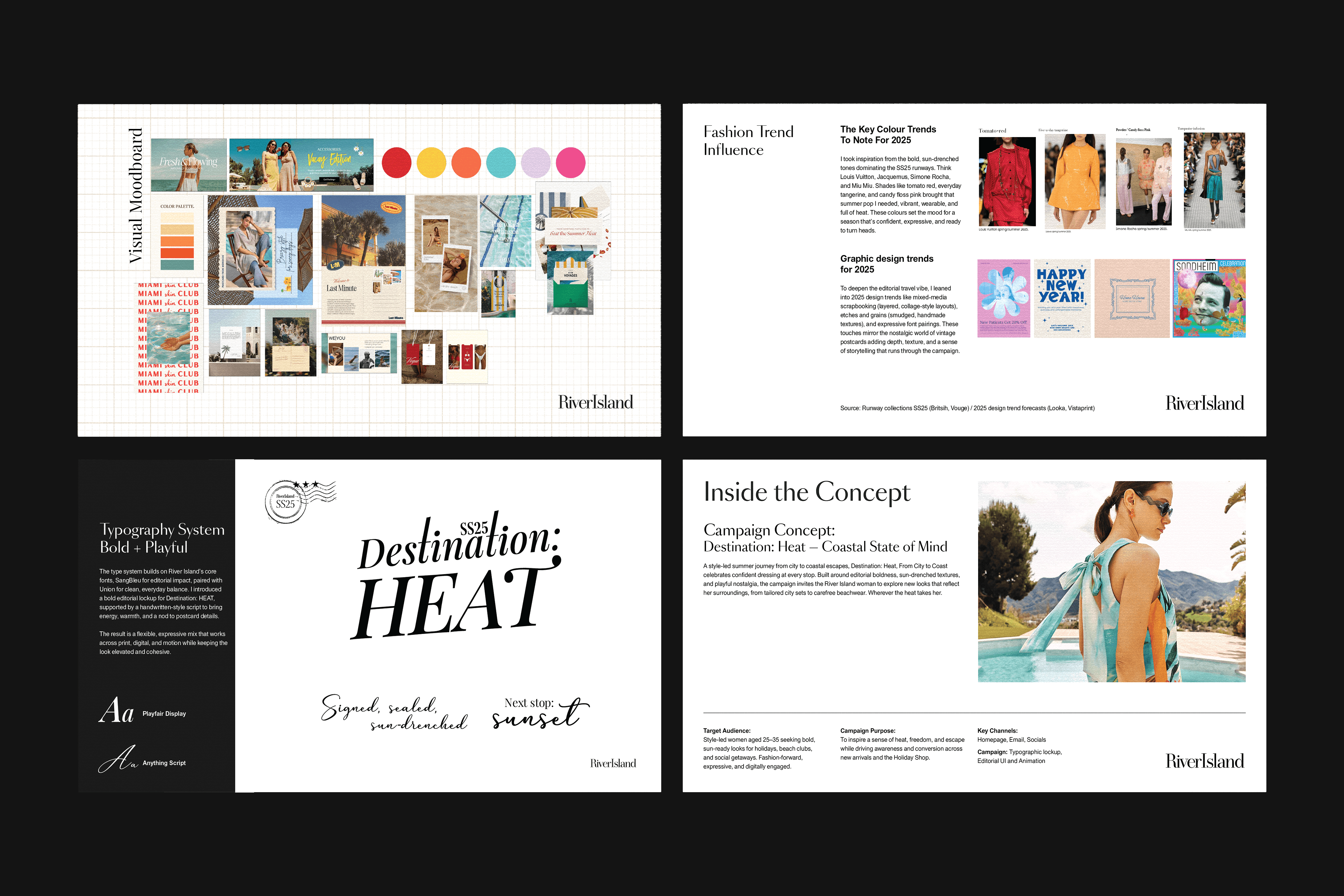
I developed a warm editorial visual language inspired by a nostalgic coastal feeling, designed to capture the feeling of either looking forward to travel or returning from it. Riviera styling, sun-faded tones and tactile summer textures helped create a relaxed sense of escapism, while postcard-inspired details, script typography and warm, curated copy brought the concept to life. Imagery remained central throughout, allowing styling, mood and product to speak for itself with restraint.
Visual Language
I developed a warm editorial visual language inspired by a nostalgic coastal feeling, designed to capture the feeling of either looking forward to travel or returning from it. Riviera styling, sun-faded tones and tactile summer textures helped create a relaxed sense of escapism, while postcard-inspired details, script typography and warm, curated copy brought the concept to life. Imagery remained central throughout, allowing styling, mood and product to speak for itself with restraint.
Campaign System
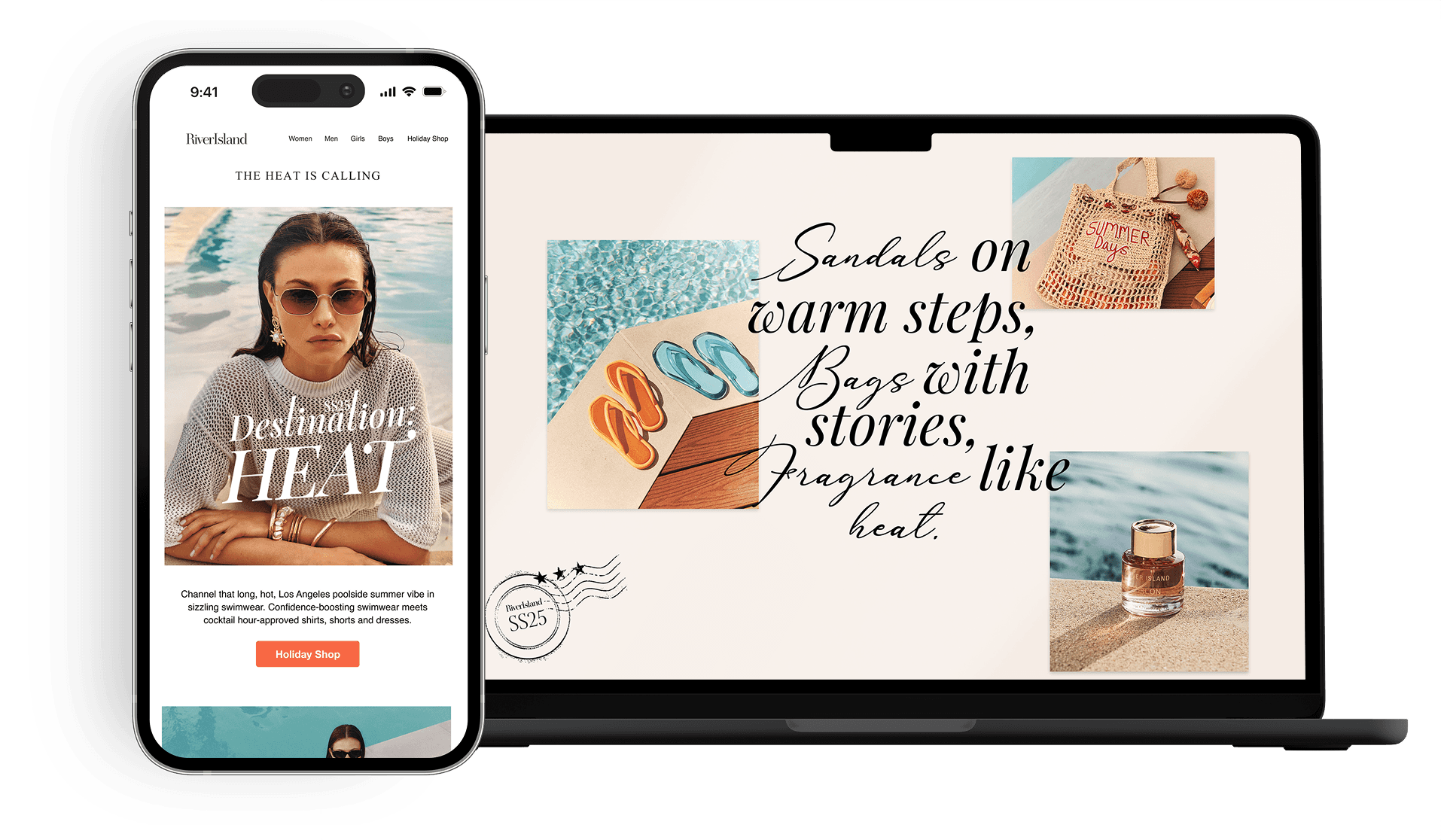
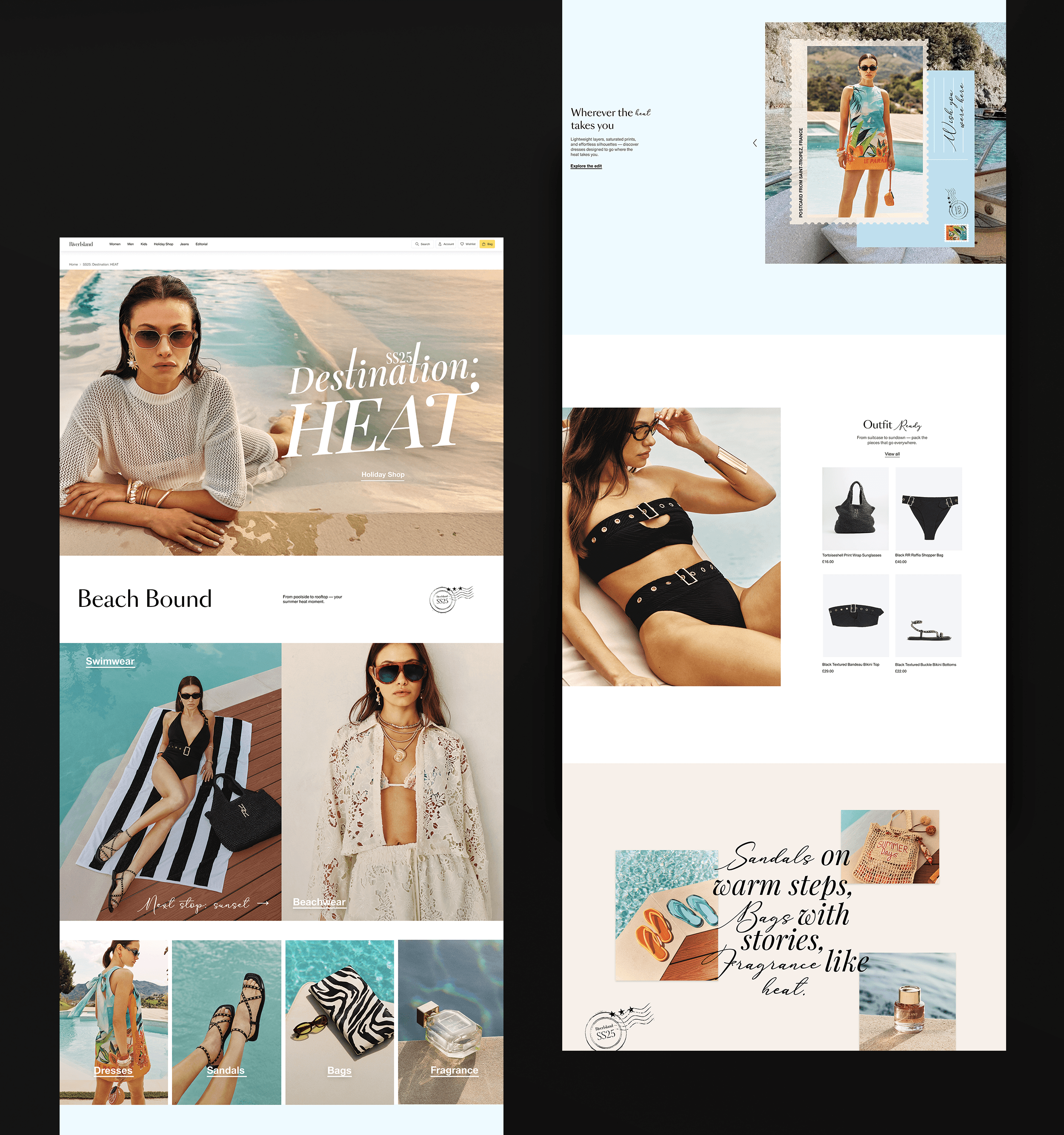
I translated the visual direction into a flexible campaign system across homepage, email and social, using consistent typography, a pared-back colour palette and modular layouts to create a cohesive and memorable campaign feel across formats. Assets were thoughtfully adapted across sizes, balancing editorial storytelling with commercial clarity while maintaining consistency throughout the rollout.
Feedback
Described by River Island as “beautifully well rounded project”, with positive feedback on the clarity and execution of the campaign direction.
Campaign System
I translated the visual direction into a flexible campaign system across homepage, email and social, using consistent typography, a pared-back colour palette and modular layouts to create a cohesive and memorable campaign feel across formats. Assets were thoughtfully adapted across sizes, balancing editorial storytelling with commercial clarity while maintaining consistency throughout the rollout.
Feedback
Described by River Island as “beautifully well rounded project”, with positive feedback on the clarity and execution of the campaign direction.